In the previous articles of this series, we introduced readers to the theories and design guidelines of data visualizations, which are the foundation of building engaging and compelling data visualizations. We also discussed how to present data effectively in a table format. In this article, we will shift the focus to the practice of data visualization, specifically charting. Charting is a common type of data visualization by which data are represented in the form of a graph or diagram. We will discuss individual charts based on a framework for purpose-oriented chart selection. In addition to the characteristics of different charts, we will include online tutorials demonstrating the steps of using Microsoft Excel to create the charts.
The chart selection framework we will use was proposed by Dr. Andrew Abela, who first published the framework on his website Extreme Presentation in 2006. Abela’s framework intends to serve as a decision tool to help answer the common practical question when creating charts: “What chart should I use for my data?” Using Abela’s framework, a user can identify the proper chart after answering a series of questions, starting from the topmost one: “What would you like to show?”
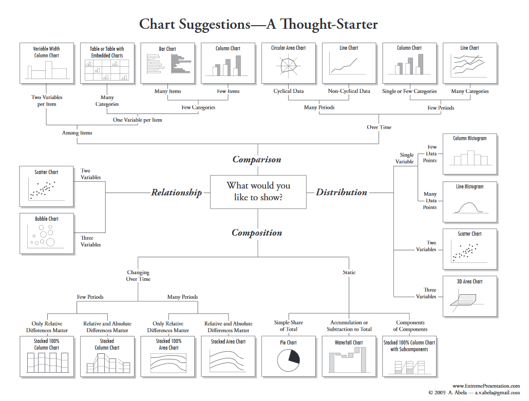
Figure 1: Chart Selection Tool by A. Abela
Four purposes—comparison, distribution, composition, and relationship—can be used to answer the topmost question in Abela’s framework. Charts for comparison allow the users to compare values across different categories and times. Charts for distribution visualize data to show the distribution of the data. Charts for composition illustrate the part-and-whole relationship within the variables. The charts in the last category, relationship, show the trend and interaction between two or more variables.
Once the purpose of the charting is set, a user can narrow it down to a specific chart or charts by answering several additional questions about the data. Notably, a chart may serve more than one purpose. For example, the scatterplot chart can illustrate the relationship or distribution between two numeric data variables.
So, how should we determine the purpose of the charting? It should be based on the research or assessment question you have. For example, if you would like to understand the trends of telemedicine services at a clinic, you are likely to compare values (e.g., the number of appointments) over time (e.g., year, quarter, month). Therefore, you should look for the chart in the comparison category and even a step further by looking at the subgroup “over time.”
The final choice of a chart could be restricted by the type of data you have in hand, especially if you conducted a secondary data analysis when the data was collected for a different purpose. For example, if no date/time variable was collected in the previous example, it is impossible to compare the clinics over time, so a line chart could not be used.
Adela’s framework is straightforward to use. Most chart examples in the framework can be created in Microsoft Excel, which is the tool we used to build the demos for this article. We chose to use Microsoft Excel for the demos because of its near-universal availability at workplaces. Most health information (HI) professionals should have some fundamental knowledge (e.g., data entry, formula, pivot chart) on how to use Excel. The purpose of the demos is to show how to quickly create some charts to visualize the data in Excel. However, the charting functionality in Excel is still limited. Users interested in advanced data visualization should explore software that specializes in data visualization.
It is important to point out that the list of candidate charts included in Abela’s framework is not exhaustive. For example, a heatmap, a chart that uses hues to show the frequencies of different categories between variables, is not included in the framework.
We use Abela’s framework for its simplicity and the decision tree structure. There are other available frameworks for choosing a chart. For example, the Financial Times has an extensive chart vocabulary guide that places the charts in nine different categories.
The set of charts discussed in this article are within the comparison category, particularly the subset dealing with comparison among items. In other words, there is no date/time element in the comparison. The comparison is static across categories. Four charts are listed under comparison among items: bar chart, column chart, table of bar charts, and variable width column chart. The foundation of these four types of charts is the bar chart, a categorical comparison of quantitative data encoded as horizontal rectangles with the length representing selected quantitative values and each rectangle representing a category. The column chart is a vertical bar chart. A table with bar charts is a list of bar charts placed in different cells of a table. The variable width column chart is a column chart with the width also being used to encode another numeric variable or quantity.
We will use a small dataset to illustrate the steps of creating a bar chart and its variations (Table 1). The data is purposely kept small (six observations and six variables) and self-explanatory for easy comprehension. A series of YouTube videos have been created to demonstrate how to create different charts. To follow the steps in the tutorial, it is assumed that the users have some fundamental knowledge of Excel (e.g., PivotChart or entering formula). Readers are encouraged to practice charting with their data.
|
Patient Name
|
Race
|
Gender
|
Age
|
Weight (lb)
|
Height (inches)
|
|
A
|
White
|
M
|
36
|
153
|
70
|
|
B
|
Black
|
F
|
32
|
121
|
65
|
|
C
|
White
|
F
|
55
|
117
|
63
|
|
D
|
Black
|
F
|
23
|
115
|
69
|
|
E
|
White
|
M
|
40
|
163
|
73
|
|
F
|
Black
|
M
|
49
|
199
|
72
|
Table 1: Sample Data for Building the Charts
As mentioned in our previous discussion, a bar chart is one of the best representations of quantitative data as cognitively we can compare the magnitude of bars with accuracy. In a bar chart, the values of a categorical variable are placed along the Y-axis, and the value of a numeric variable (e.g., age) or the frequency of the values of the categorical variable (e.g., number of patients in each gender) are shown as horizontal bars. The value of each bar can be derived after projecting the bar perpendicularly onto the Y-axis. Figure 2 is a bar chart showing the age of each patient (tutorial). In this example, each patient’s name, a categorical variable, is listed on the Y-axis, and their age, a numeric variable, is encoded as the lengths of the bars drawn for each category positioned along the Y-axis. We prefer to label each bar with the values for each category so one of the axes and gridlines (default setting in Excel) could be removed as they become redundant.
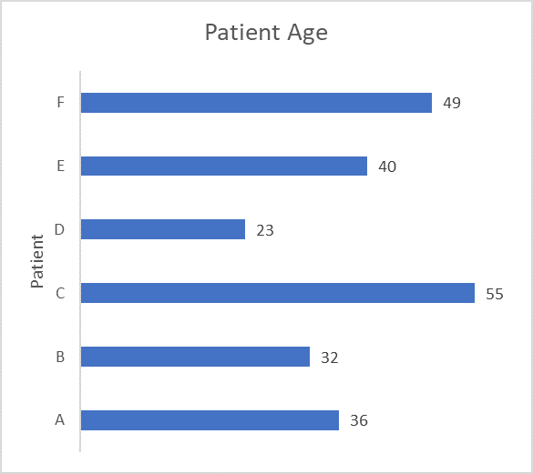
Figure 2: An Example of the Bar Chart
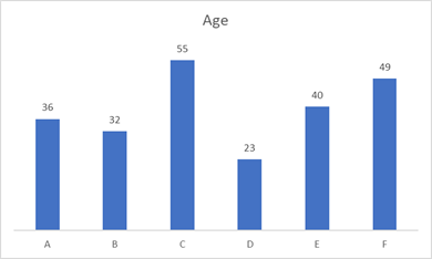
Figure 3: An Example of the Column Chart
If the rectangles of a bar chart are represented vertically, it becomes a column chart (Figure 3, tutorial). It is suggested in Abela’s framework to use a column chart if there are few items (number of categories in a categorical variable) and to use a bar chart if there are many items. That is an excellent heuristic to follow. One additional advantage of using a bar chart over a column chart is that the names of each bar can be displayed horizontally for each category so they are easier to read. If the names in the categorical variable are long, it is more than likely that they will overlap each other in a column chart, which makes them hard to read. In this situation, a bar chart is a better choice.
Although bars in a bar chart usually have the same width, it is possible to use the width of the bars to encode a second numeric variable. This type of bar chart is called a variable width column chart. A variable width column chart uses both the width and length of a rectangle (bar or column) to encode two different quantitative values. For example, if you would like to visualize the six patients’ height and weight using a bar or column chart, you can use the variable width column chart to do so.
Unfortunately, Excel has no direct choice of a variable width column chart in the available charts. An excellent hack using the area chart in Excel to create the variable width column chart is available here. We created a shortened version in our tutorial. A variable width column chart should be used when it is meaningful to display the two numeric variables on the same column chart. One of the challenges is that it is hard to compare the difference between the widths since they don’t start on the same baseline. A scatterplot usually is a better option for displaying two numeric variables.
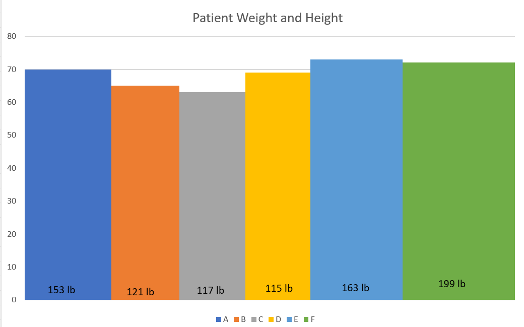
Figure 4: An Example of the Variable Width Column Chart
Other Types of Bar Charts
Clustered Bar Charts
A clustered bar chart, sometimes called a grouped bar chart, displays a series of two or more categorical variables together as clustered bars. Each cluster represents the values of the first categorical variable, and each bar represents the second category variable stratified by the first variable. In the example cluster bar chart here (tutorial), the two categorical variables are race and gender. The bars are clustered for each value of the race variable (black vs. white), and each bar represents the average age of each gender stratified by the race variable. Color-coding is needed to discern the bars in the same cluster. Because all bars are drawn from the same baseline, we can compare the values in the same cluster or across different clusters. We don’t recommend using clustered bar charts for more than two categorical variables or if one of the two categorical variables has too many values, as it will make the comparison hard for bars in different clusters.
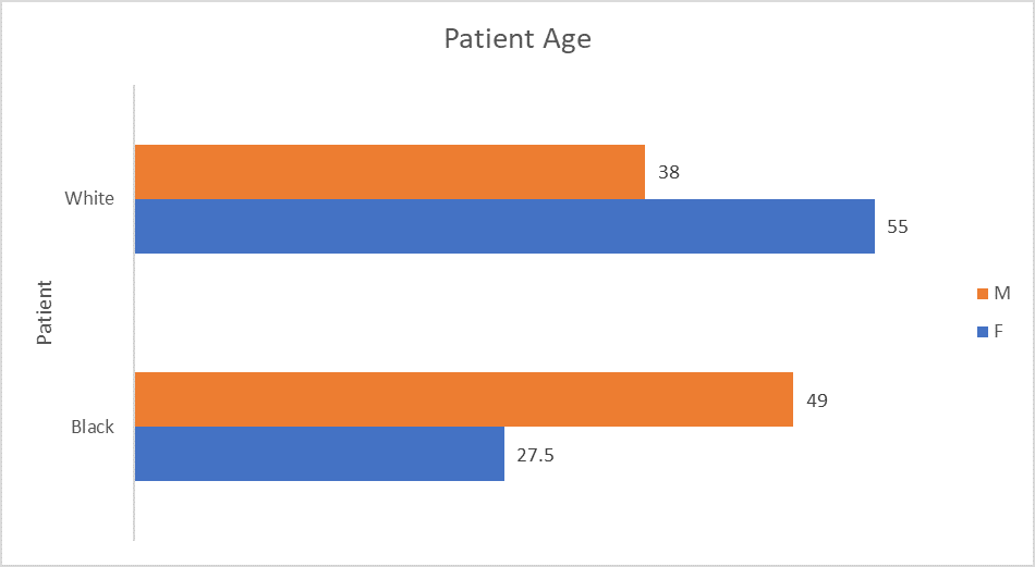
Figure 5: An Example of the Clustered Bar Chart
Stacked Bar Charts
Like clustered bar charts, stacked bar charts are used to display quantitative values for two or more categorical variables. Unlike the cluster bar charts, all individual bars are “stacked up” on the values of the first categorical variables (tutorial). Due to the nature of stacked bars, it can be used to demonstrate the part-whole composition, which we will discuss in a later article.
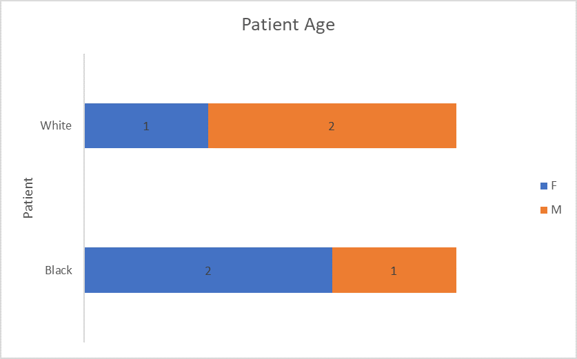
Figure 6: An Example of the Stacked Bar Chart
Histogram
A histogram chart, which will be discussed in a later article, is a particular type of bar chart. It takes a numeric variable and groups the values into adjacent bins. Then, the count of elements in each bin is used to draw a column chart. It is one of the first choices when examining the distribution of all values of a numeric variable. We will describe histogram in details when discussing charts for data distribution.
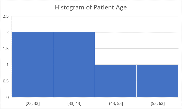
Figure 7: An Example of a Histogram
Pareto Chart
A Pareto chart is a column chart sorted from the tallest on the left to the shortest on the right. Optionally, a line chart showing the cumulative sum is drawn on the same chart along the same X-axis. It helps to show which category impacts the total values most. Figure 8 is a Pareto chart showing the impact of a patient’s weight on the total weights of the group (tutorial).
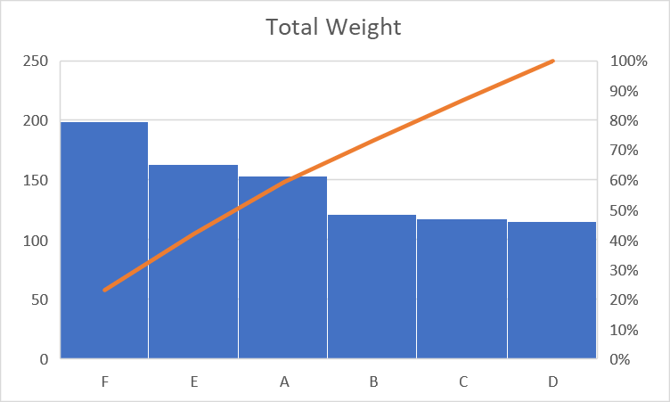
Figure 8: An Example of a Pareto Chart
Lollipop Chart and Dot Chart
A lollipop chart (Figure 9) is a fun variation of a column or bar chart (tutorial). Each column looks like a lollipop with a round head on top of a thin body. To create a lollipop chart, you can use the combo charting option in Excel by combining a bar chart with an X-Y dot chart. Since the flat top of the bars are replaced with round dot, it is not possible to read data from the axes. Therefore, data labels are usually shown within the “lollipops” to make them more explicit. A lollipop chart without the thin stems becomes a dot plot, which can also be used to represent numeric data by categories. Again, data labels should be added within each dot.
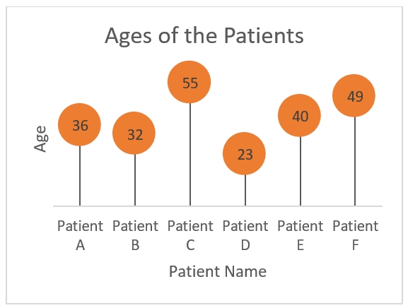
Figure 9: An Example of the Lollipop Chart
When Not to Use a Bar Chart
Bar charts should not be the first choice if there is an element of date/time in the comparison. In that situation, a line chart is a better option, especially when the type of date/time data is granular at the day or week level. If the comparison is between low granular values such as years, quarters, or even months, then a bar chart could be a viable choice.
Bar charts should also not be used when the variables included are all numeric variables. We need at least one categorical variable to place the bars. For example, if we need to examine the relationship between weight and height in our data example, it is hard to use a bar chart here as there are no categories in either variable. If you still want to use a bar chart in this situation, then you will have to group the values of one numeric variable into bins (e.g., short, moderate, or tall for the height variable) and then build bar charts using the new delineated variable and the remaining numeric variable.
In summary, bar charts should be one of the de facto charting options to compare values in different categories statically. Data encoded as the length of a bar or a column are easy to compare visually. Different variations of bar charts do exist to add dimensionality and effectiveness. Most of the bar charts and their variations can be created using Microsoft Excel.
Xiaoming Zeng (xiaoming_zeng@med.unc.edu) is a research professor in the Department of Psychiatry at the University of North Carolina at Chapel Hill.
Katelyn H. Rouse (hardyka16@ecu.edu) is a clinical assistant professor in the Department of Health Services and Information Management at East Carolina University.
By Xiaoming Zeng, MD, PhD, and Katelyn H. Rouse, MS-HIIM, RHIA
Take the CE Quiz